Store Décor: Expert Advice
Checking in with the pros on the five most common store décor mistakes—and how to avoid them
By Erinn Morgan
Are you making an optical décor misstep that could easily be resolved? Some of the most common store décor snafus made today by optical retailers can actually hinder sales.
The good news is that most design and display mistakes can be quickly rectified to restore order to your in-store décor. Here, we offer an inside look at five of the most common problems, plus targeted advice from décor pros on how to fix them.
THE PROBLEM: THE WRONG BULBS
1 According to Magic Design's president, Cy Furman, lighting is where many eyecare professionals go astray in their dispensary design efforts.
"One common error ECPs make is to under-light the merchandise," says Furman. "As a result, the eyewear in the dispensary can look flat and uninteresting."
Poor lighting does not flatter the eyewear—or its potential consumer. Instead, it can hinder their frame selection.
"Many offices have fluorescent lighting in a cool white color," says Furman. "The bulbs last a long time, but they are cheap and not right for most offices that display colored merchandise with fine details."
"Fluorescent lighting is fine for general lighting, but not good enough for displaying eyewear," says Barbara Wright, owner of Barbara Wright Design.
"When fluorescents are used in showcases, the lighting is too cool and it distorts the color of the product and makes merchandise look ‘flat.’"

THE FIX:
Make the simple correction of replacing "cool white" fluorescent lighting with color-corrected florescent bulbs that flatter the customer. "You need a warm white," says Furman. "Something closer to natural light. I suggest using an SP35 that has a natural redness in it."
For showcases, Wright suggests that, "Halogen is a better choice because it makes frames sparkle and brings out their true colors and fine details. However, if all you have are halogen lights at the top of a showcase with glass shelves, it will not light up the merchandise on the bottom shelves."

THE PROBLEM: THE WRONG LIGHT FIXTURES
2 Uninspired lighting fixtures can create an environment where the optical merchandise is poorly lit—either under-lit or over-lit, where everything is whitewashed and shown at a distinct disadvantage.
THE FIX:
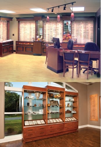
Furman suggests using accent lighting such as decorative pendants to draw interest to specific areas, such as front window displays, styling areas, and the reception desk.
"Use lighting that has the ability to enhance detail and color, like track lights which can be aimed properly to highlight and minimize glare," he says.
Wright also suggests using halogen track lights that can be aimed at the lower shelves, but notes that halogen lighting can create a lot of heat in showcases with doors. An alternative choice, LED (Light Emitting Diode) strip lighting, should be used above solid fixed shelves in cubicle showcases because it is bright enough to show off the frames without any heat buildup.
THE PROBLEM: TOO MUCH CLUTTER
3 Is your dispensary experiencing a buildup of old, outdated point-of-purchase materials? Corey van Duinen, president of Illusion Optical Display, says that presenting a cluttered look is one of the most common mistakes ECPs make.
"Most of the time, these displays are complimentary from frame manufacturers and there's a feeling that ‘if we've got it, we might as well use it.’ It's an easy trap to fall into," adds Dan Sloan, a designer with Fashion Optical Displays.
"You have to remember that you are competing with professional retailers that pay close attention to the look and feel of their locations," he adds, suggesting that you try to match or exceed what your clients are seeing elsewhere "to retain their confidence in the quality of your products and services."
THE FIX:
Sloan says the best rule of thumb is: "If it adds to the dispensary, use it. If not, get rid of it."
Start off by forming a clear idea of the look and feel you want in your office and make all point-of-purchase editing decisions based on this.
"These displays are primarily meant to help brand a particular company whereas the practice needs to be more concerned with their own branding first," says van Duinen.
"Rotate displays and marketing pieces on a regular basis. This will help reduce clutter but will also help in creating changes in the dispensary that will be noticed by clients," adds van Duinen.

THE PROBLEM: RELYING ON REFLECTIONS
4 Another prevalent store décor misstep is making the background behind the frame displays or frame boards mirrored.
"The duplicate images and visual distractions that appear in the mirror make it hard to focus on the product," says Jan Ennis, president of Ennco Display Systems.
"People want to give the appearance of having more frames than they really do, but if someone has difficulty maintaining focus, they will never be able to key in on one frame to make a selection when all they see is a sea of frames," he adds.
THE FIX:
Ennis says that simply eliminating mirrors, except in the try-on areas of the dispensary, would fix the problems caused by background mirrors.

Keep your dispensary exciting by utilizing a mix of product displays as well as enticing décor. Images courtesy of (top to bottom): Dispensary design by Magic Design; Cape Cod dispensary fixtures from Illusion Optical Display; and Highlight Tower from Bright Displays
THE PROBLEM: A LACK OF EXCITEMENT
5 Is your dispensary awash in a sea of beige? Using plain colors for the dispensary's upholstery fabrics, carpets, and countertops can lead to visual boredom for customers.
"Plain fabrics are very inexpensive and standard for most chair suppliers, but they show wear very quickly, along with stains and marks," says Jerry Ku, Eye Designs' managing and the firm's design director for the western region. "Plain carpets and countertops tend to be less expensive and are often standard issue from most landlords."
THE FIX:
Consider using more dynamic and visually appealing fabric, flooring, and countertop patterns when remodeling or replacing these items.
"It will make your space more friendly and also help hide stains, spots, and dirt," says Ku.
When choosing décor colors and patterns, consider nature-inspired and earth-toned color schemes that are easy on the eye, clean, and calming to patients and staffers alike. Adds Ku: "Also, try to add in a pop of color that won't be outdated in a year or two." EB


