MERCHANDISING BY COLOR
Merchandising by COLOR
Any way you roll, using the color wheel in presenting product creates eye-catching displays that jump-start sales
BY TRAVIS J. REED
mERCHANDISING YOUR PRODUCTS by color instead of always by brand can be a fresh approach and a more visually appealing way to attract the eye of the consumer. A few things must be noted for beginners, as the process is simple, but has some basic rules to follow.
First, know your color wheel from school and use that to determine the order in which to put the colors. You can start with any color you like; it can be a trend color, or you can work from light to dark or from warm to cool.
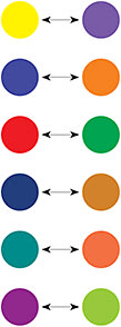
After you begin with that color, however, follow the order of the wheel. For example, if you begin with blue, then next you will use green and then yellow, followed by orange and then red. The color next to the first one you use should be created with the color to which it is adjacent. For example, you start with blue and next to it is green, because green is made with blue. It is also made with yellow, so yellow goes next. Use the wheel shown here as your guide.

OPPOSITES ATTRACT
Use opposite colors on the wheel when you want to make the most impact. They are called complimentary colors, and include blue with orange, red with green (only during the winter holidays!), yellow with violet, etc. When you use complimentary colors together, they exaggerate each other.
If you create a window display that focuses on blue frames, a yellow backdrop will really make the product jump out at customers and passersby.
TREND TALK
Next, know your color trends. Pantone is the company you want to follow online for yearly and quarterly fashion color trends. The color of the year for 2014 is Radiant Orchid. In the last two years we have seen a lot of 2012’s color, Tangerine Tango (a reddish orange), and Emerald for 2013 (yes, as in the city of Oz!).
COMPLIMENTARY COLORS


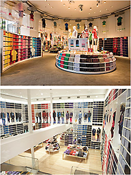
Images courtesy of Uniqlo/Fast Retailing Co.
{QUICK TIP}
Double Exposure
When possible, double expose your frames that are trend current. That means get two pairs—one that stays on the frame board where it belongs with the rest of that color or brand, and then do another display or fixture of just that trend color. You can also do this with a trend style as well—by just using a small fixture or by simply creating a grouping of aviators, for example.
Don’t walk away from recent trends like last year’s colors, as they don’t vanish overnight. Do however, look ahead to this blend of purple, fuchsia, and pink as a go-to product when buying for Spring/Summer 2014. And, don’t forget colors that work great with it like orange, yellow, and green.

Pantone’s Men’s Fashion Color Report for Spring 2014
Not everything you buy or sell has to represent a trend color, but it is wise to inventory and display things that look great with the current trend. For example, a client might wear a dress in trendy purple and want a contrasting pair of frames in yellow or orange. This pairing draws even more attention to your product, so everyone wins!
GO VERTICAL
Lastly, merchandise by color vertically, from top to bottom. Use the same color, and still go in that color order indicated on the wheel, moving from left to right. For example, blue frames should have blue above and below them. If you want, you can do lighter blue at the top and darker as you move down.
Also, don’t be afraid to do a color-trend window display, vitrine, shadow box, etc. Paint the back of a window box or bottom of a vitrine the trend color or a contrasting color and display trend color items and add signage or vinyl lettering to call out the trend. One easy way to do this is to frame a page from a trendy magazine like Vogue or Lucky that will help customers visualize the trend so that the display is easy to follow.
Have fun with this new way to show your merchandise. You will find that the more you practice, the easier it becomes.

Travis J. Reed is the owner of Creative Visionary, Inc., in Chicago.


