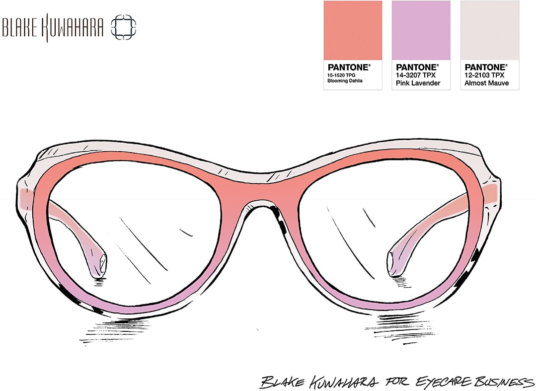
Take a look at the expanded color palette for Spring 2018 + two edCFDA designers share exclusive specs sketches in the unconventional palette
which Pantone colors graced the catwalks for Spring 2018?
This season, the Pantone Color Institute experts broadened the palette of top hues for the season—offering 12 callout colors that stood out on the New York Fashion Week runways.
“The color palette showcases an appreciation for the complexity and distinctiveness of color and the expression of it, which is something that evolves and can be played with,” says Leatrice Eiseman, executive director of the Pantone Color Institute. “Consumers need more variety, and this expanded palette embraces the lack of gender and seasonal borders we are seeing within the fashion industry.”
Dive into the delectable hues on tap for the season, including shades like Lime Punch, Chili Oil, and more, that can spruce up your frame assortment and add appealing touches of color to your office interior.

—Kerri Ann Raimo

Spring 2018 Top 12 Color Palette
Pantone expands its traditional 10-color palette, offering a dozen hues to devour for Spring 2018

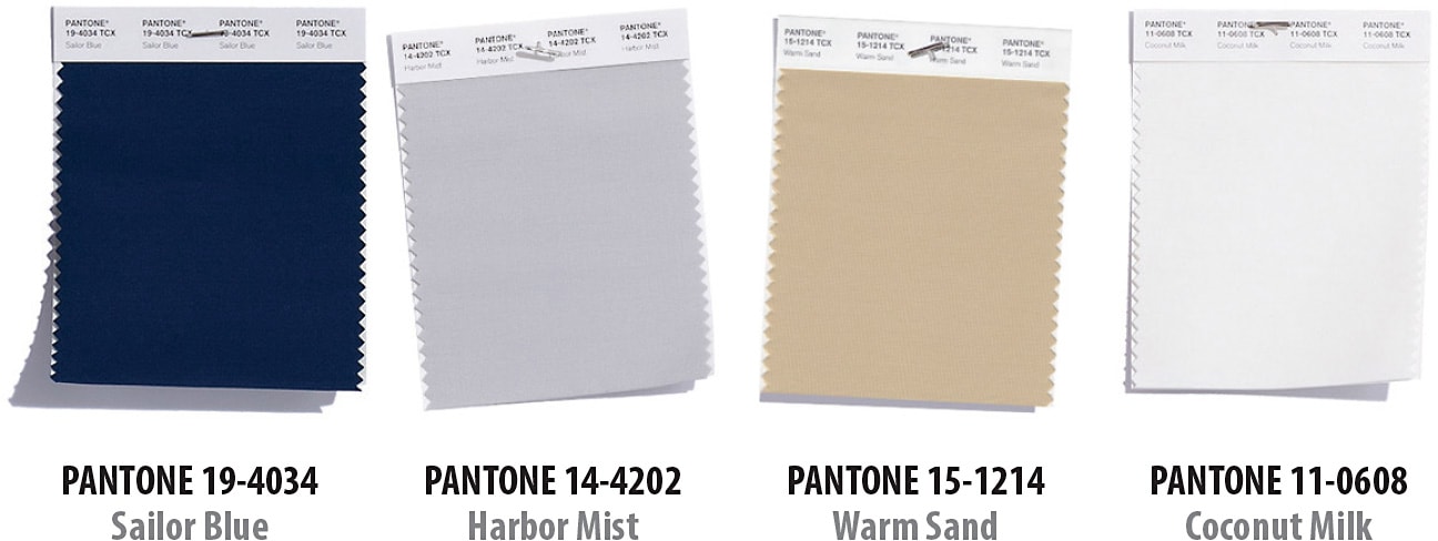
Spring 2018 Classic Color Palette
The Pantone experts selected four hues to bookmark as core, classic colors to serve as the foundations of this season’s style

Vibrant Hues

Selima Salaun, a member of the eyewear designers of the Council of Fashion Designers of America (edCFDA) and the creative visionary behind Selima Optique, embraces vibrant colors in her designs—and takes note of their appearance on the runways.
“Considering that the general mood has been quite gloomy lately, designers have used tons of vibrant or pastel colors in their Spring 2018 shows,” Salaun says. “Vibrant like if you were taking a stroll by Havana, Cuba, or by the Mediterranean Sea—think Hydra, Capri, Santorini. I am obsessed with Luis Barragán’s architecture: energizing red, yellow, sky blue, etc. Pastel hues for a romantic feel. Colors make people happy.”


