


Frames aren’t easy to display, and they never have been. Making them pop has always been a challenge.
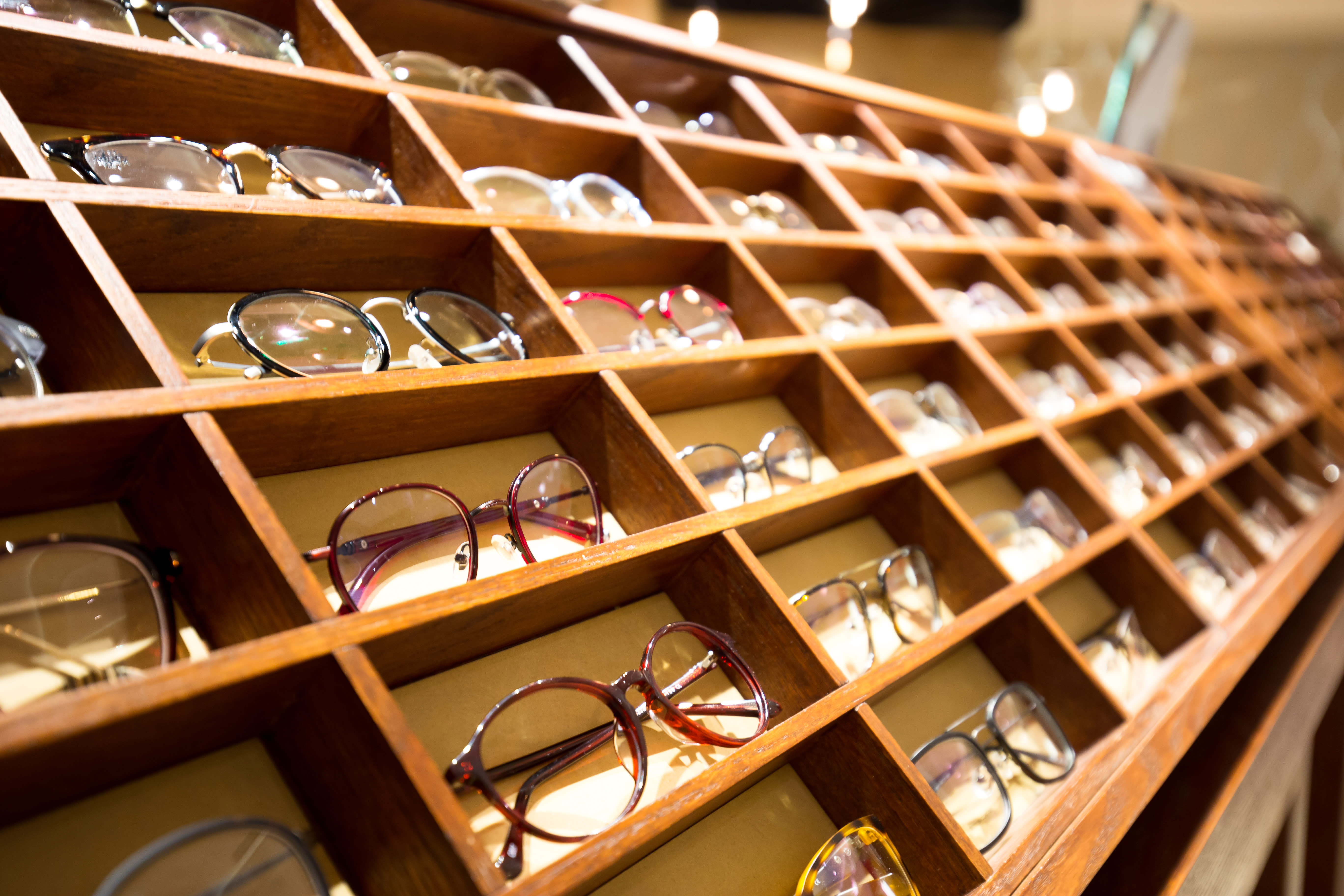
More than a century ago, “Wizard of Oz” author L. Frank Baum wasn't just penning prose about red shoes. He was also writing for Show Window Magazine, and his advice is still applicable today: “Suggest possibilities of color and sumptuous display that would delight the heart. Bring the goods out in a blaze of glory. Make them look like jewels.”
How can you do that with today’s eyewear? That’s what we asked 2 visual merchandising experts, Travis Reed, CEO of Creative Visionary, based in Las Vegas, and Eric Feigenbaum, author of the book Profiles of the Mannequin and New York Editor of VMSD (Visual Merchandising and Store Design) Magazine. Here, they share several tips and tricks of the trade to display eyewear like a pro:
-
Starting point. “To create your display, focus on a style, color, brand story, or current trend,” says Reed. “Walk around as if you were a customer and see what colors, patterns, styles, or materials are repeated most. Also, look at consumer fashion magazines, blogs, and websites.”
-
Picking a location. “Eighty percent of customers turn to the right when they enter your store,” says Feigenbaum, “so play on this by positioning a focal point (read: an area highlighting sunwear, fashion trends, etc.) to the right…but at the end of the area or their sight line to help draw them forward.”
-
Setting the stage. Reed suggests asking yourself several questions: What does this merchandise make you think of? Who would wear it? Where are they going in it? Why would they buy it? “That information can help you set the stage for the display,” he says.
-
Creating risers. “Displays or risers that elevate frames properly are necessary tools, but try to add variety,” says Reed. “Go online for alternatives, or try a local floral wholesaler for cylinder vases. Turn the vase upside down and put a brand logo on it in frosted vinyl with the glasses on top.”
-
Odd or even? “Visual merchandisers often go by a rule that odd numbers look most appealing, so a group of 3 or 5 items might be a good start,” adds Reed. “At times, though, just 1 amazing product can make a statement on its own. “
-
Go vertical. “Separate colors vertically—light to dark, warm to cool—and alternate solids with patterns,” says Reed. “Vertical merchandising moves the eye upward and opens new vistas and merchandise stories,” adds Feigenbaum. “Strategic positioning of highlighted vertical displays and changing product presentations can also help put the spotlight on key items.”
-
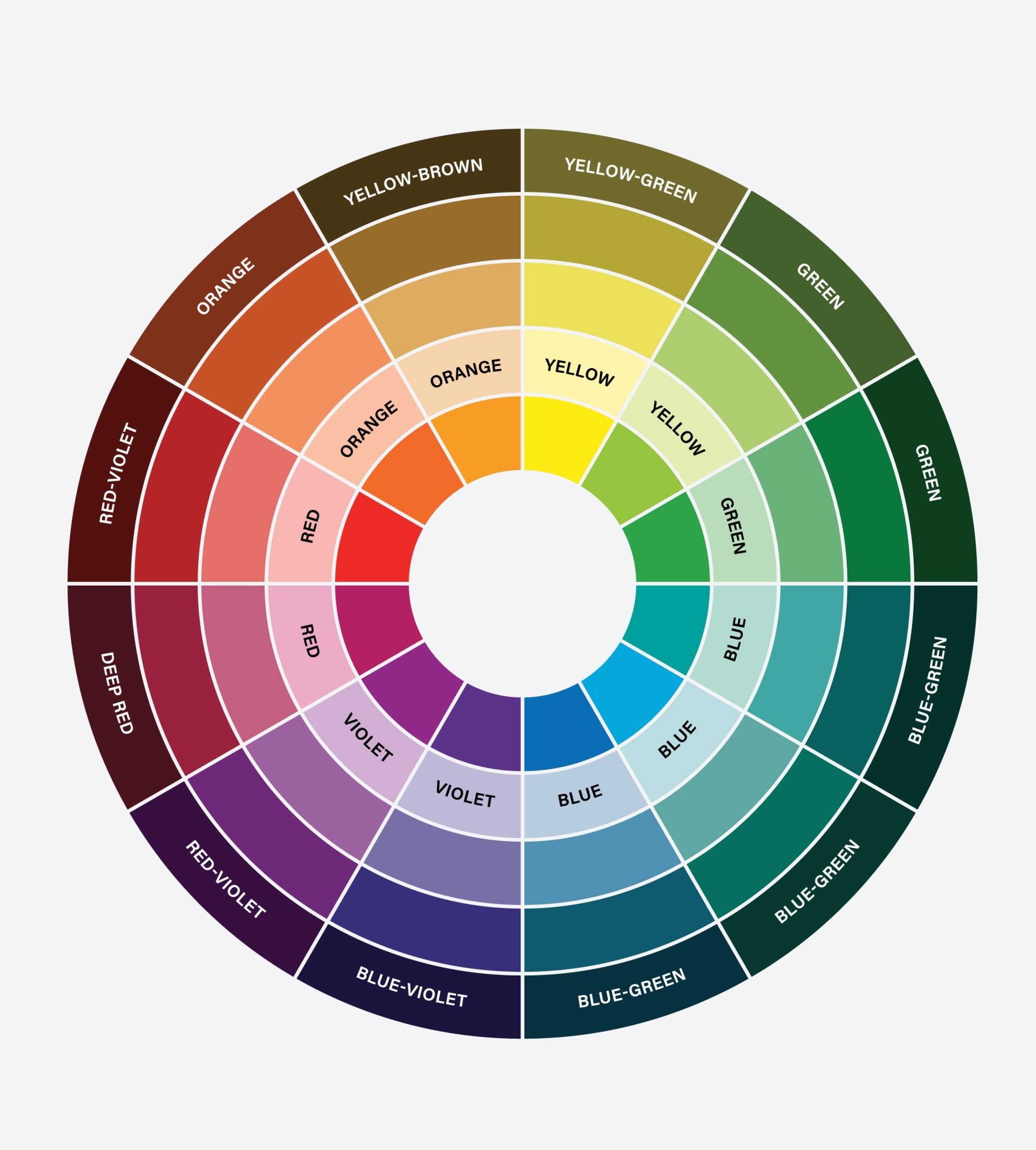
Use a color wheel. This tool can help “determine the order in which to display frame colors,” says Reed. “You can start with any color you like. It can be a trend color, or you can work from light to dark or from warm to cool. After you begin with that color, however, follow the order of the wheel. For example, if you begin with blue, use green next, and then yellow, followed by orange and then red.”
However you set up your display and use that wheel, be sure to follow current color trends and pull them into your displays. One way to stay abreast of what’s hot is to check out the Pantone Color Institute (www.pantoneusa.com) regularly.
Most importantly, be sure to change displays frequently, especially if you have a window that’s visible to the public. Rotating and changing your frame selection gives consumers one more reason to return often.