

Designing for Sales
Positioning your practice through office design can help ensure that your product and your practice are in sync and sending a clear message to patients
By Barbara Wright
Practitioners often struggle because the look of their office is at odds with the image they try to create with their marketing. The office environment becomes an obstacle to overcome instead of an asset that promotes the desired positioning.
The most successful practices develop a core marketing message that is driven home over and over again in every type of communication or interaction with patients. If your desired image is one thing but your office decor tells a different story, patients get a mixed message. That can reduce or even cancel out the effectiveness of all your other attempts at positioning.
A Couple of Eyes blends natural elements and textures for an inviting atmosphere. All photos courtesy of Barbara Wright Design
DESIGN FOR DOLLARS
Do you want to attract higher-income, private-pay patients and reduce your dependence on insurance plans?
Are you proud of how loyal your patients are, but disappointed when prescriptions walk out the door?
It's very difficult to improve these situations if you're in a cramped, outdated office. Patients expect an up-to-date office with an enticing dispensary. Without it, you're apt to work harder but earn less.
If you are opening a new office, having an integrated look and feel to all your visual elements stamps a good impression on every patient you serve. That can bring you more referrals and shorten the time it takes to reach profitability.
Every practice benefits from developing a simple and clear positioning statement that is consistent from your logo, advertising, website, and patient care all the way through to your office decor. Even a simple thing like coordinating your business card design with your office color scheme makes a good impression.
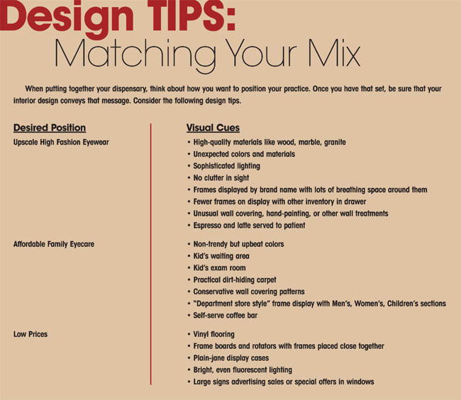
What can you do to get your office to send the same message as all your other marketing efforts? There are no hard and fast rules. However, here are some general guidelines to get you on the right track.
Marketing-driven office design helped these practices get positioned for success.
1 VISION CENTER, LAKEWOOD, CALIF. (4,500 SQ. FT.)
Located in a busy Southern California shopping mall, Vision Center is set up to grab attention with a clean contemporary design and punchy colors. The beautiful models in a photo display make the multicultural, fashion-conscious target market think: "That's me. This place must have what I want."
Benetton was happy to grant permission to use their photo for this wall graphic, which provides free exposure for their brand. Also, the brand names on the banners are large enough to be read from across the mall, drawing in patients who identify with those brands.


Specific touches make each dispensary uniquely appealing to potential patients. Shown top to bottom, Visual Effect's eyecatching front window, Vision Center's welcoming artwork, and Vision Health Specialties' blend of tech and comfort
There is a bright, light-hearted color scheme and it's easy to tell that the frame boards hold moderate-priced frames and the cubicles with glass doors showcase the higher-end frames.
Decor statement: "Affordable style."
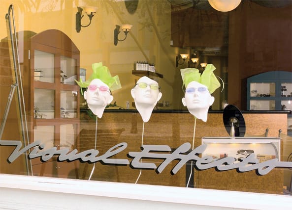
2 VISUAL EFFECTS, BREA, CALIF. (1,250 SQ. FT.)
The storefront windows were an important element for this boutique-style practice set in a renovated downtown area. Nearby restaurants, shops, and movies attract mid- to upper-income shoppers strolling by daytime and evening, too.
This window display is minimal but striking, acting as a "shopper stopper." Artful mannequin heads suspended on rods get attention with their simplicity and repetition. Upon entering, visitors find the interior looks more like an upscale optical than an optometry practice.
This target market is not looking for a bargain. They want the latest style and don't mind paying for it.
Decor statement: "You will have a great experience here and walk out looking fabulous."
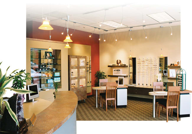
3 VISION HEALTH SPECIALTIES, MIDLAND, TEXAS (6,000 SQ. FT.)
The four male partners in this practice asked for a masculine look that would be welcoming to female patients. Cherry crown moldings and chairs, sage walls, and spruce green accents evoke a country club feeling that the partners and patients love.
Patients update their contact information on built-in touch-screen monitors that blend in with the decor. This design marries high tech with a comfortable, classic look.
Decor statement: "You'll feel right at home here and get state-of-the-art eyecare, too."
4 COUPLE OF EYES, BEAVERTON, ORE. (1,200 SQ. FT.)
When husband and wife team, Paul Shih, O.D., and Yun Fan, O.D., decided to open a dispensary, they envisioned a boutique look that would also feel warm and friendly to families. Because their area is home to a brand-conscious Asian population, they wanted a design that would give a nod to their heritage but appeal to the general population, too.
A red accent wall complements a blend of natural elements and textures, including metal laminates, slate flooring, wood chairs, live bamboo plants, and a waterfall fountain in the waiting area. Patients familiar with Feng Shui will appreciate the balance of these elements.
The main display wall features floating wood shelves and acrylic frame bars for moderate priced frames. In addition, halogen-lit locking showcases highlight upscale frames. Finally, the colors and textures are warm and friendly,
Decor statement: "You get both professional eyecare and stylish eyewear here."
If your office design is out of step with your practice, changing it can make a big difference in your bottom line. A new office that matches your marketing makes it easier for you to attract the type of patients you want and keep them coming back. EB
Barbara Wright is the author of the Optometric Office Design Bible for optometrists and offers a free report "7 Office Design Blunders," at www.barbarawrightdesign.com. She is president of Barbara Wright Design in Portland, Ore.